
What is the future for Typography?
Where do we go with typography now?
2018 is the year of extreme variation. Design trends that fundamentally oppose each other are battling it out for supremacy, whilst muddying the waters of what we know to be en-vogue for this year. Typography has always been divisive among the design community, but never more so than in the past year or so, with factions forming in order to defend their chosen typefaces in the epic fight for survival. So where do we go with typography in our designs with no clear trend to follow?
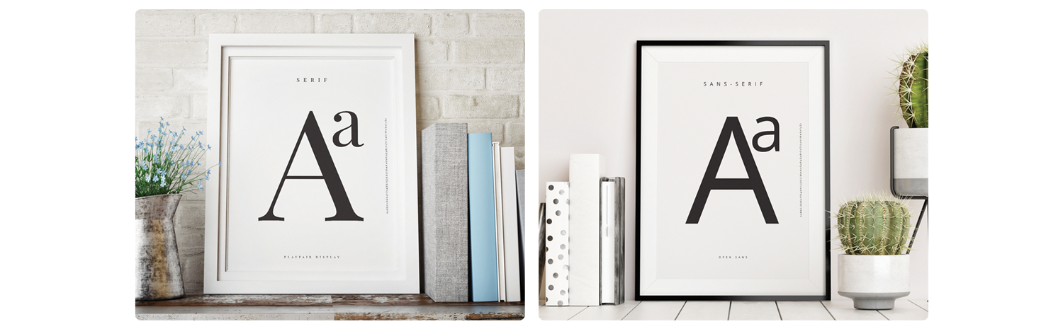
I want to start by quickly stating that font and typeface mean two separate things. A typeface is a family, such as Open Sans, whilst a font is a subset within the typeface such as ‘thin’ or ‘semi-bold’. To put simply, a font is singular whilst a typeface is made up of many fonts. Each typeface is usually classified by a group such as Serif or Sans-Serif, with each classification having many individual sub-groups... but there are far too many to list.
The Ultra Modern Trend
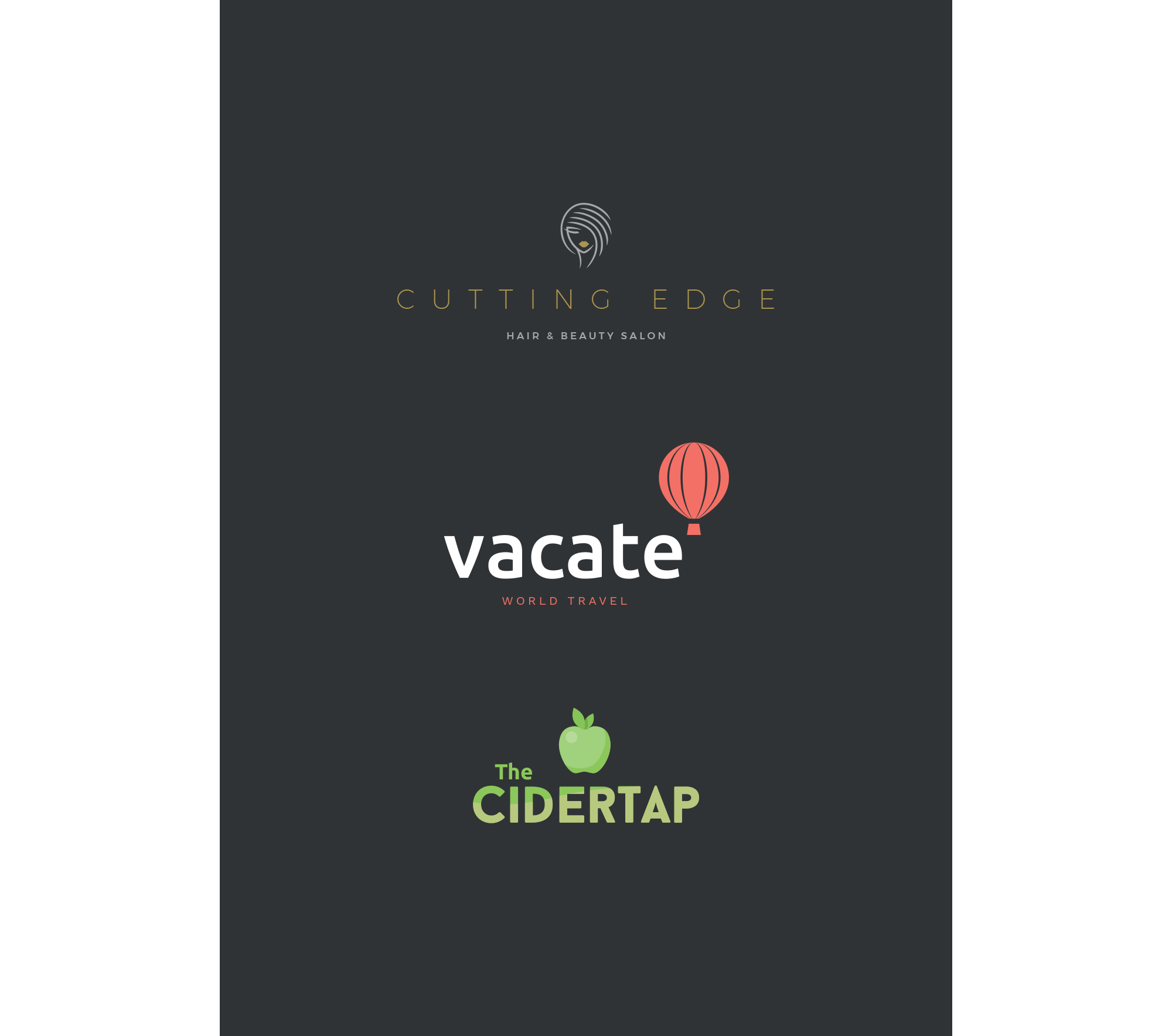
Being clean and contemporary is one of the strong factors of this trend, with companies such as Google and Apple being headliners of the Ultra Modernist movement. Mostly utilising sans-serif typefaces, the trend calls for uncomplicated and straight forward displays of text, featuring oversized headings and clear, high contrast copy.
With the likes of Helvetica, Open Sans and Montserrat in its ranks, sans-serif typefaces count for a massive portion of the typography currently seen in both print and on the web. The great thing about any typeface in this group is that it can be used by almost any business or brand and will always look clean and contemporary with great legibility. Utilising the extreme fonts in these families, such as hairline, thin, black and heavy, produces incredibly crisp display text, great for headings in brochures or online.
The Neo-Vintage Trend
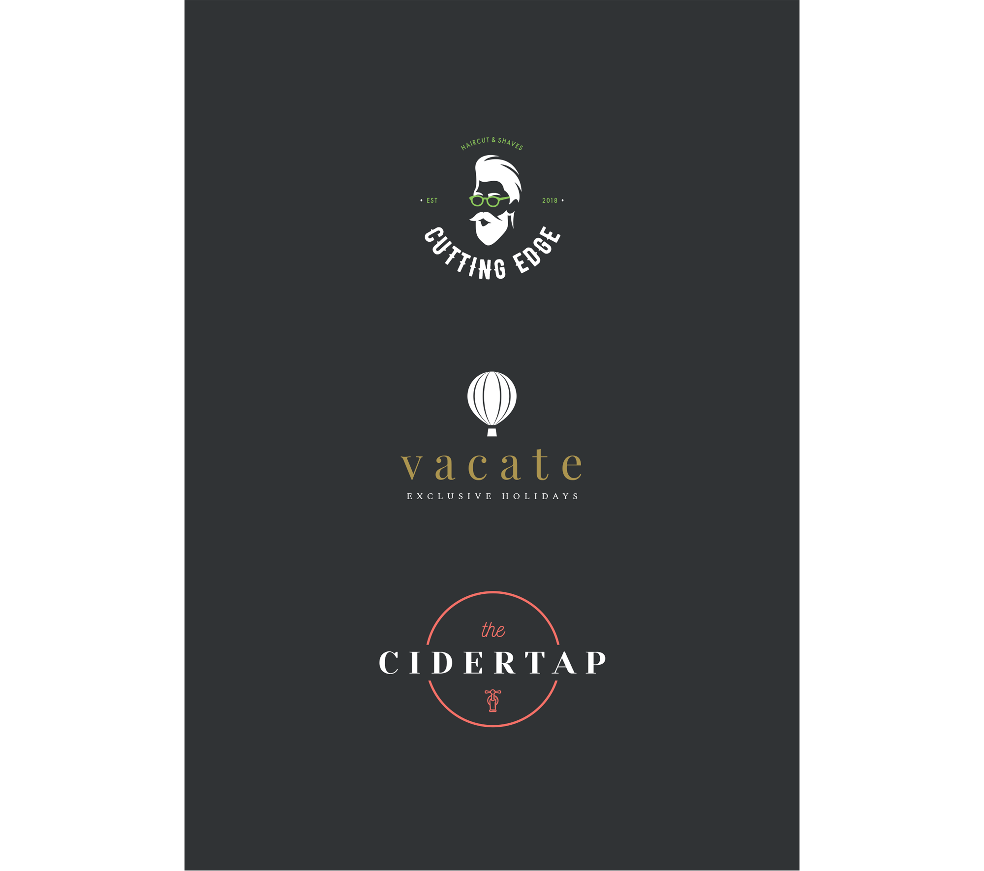
The Neo-Vintage trend was born by designers recycling vintage and retro design themes and typography and adding bright, modern pops of colour creating a quasi-futuristic aesthetic. This trend sees the use of typefaces that had passed out of mainstream use until recently, especially the classic styled serif, script and hand written styles as well as distressed or degraded typography. Eras from the early to mid 1900s are heavily referenced, but always with a quirky modern twist.
The tongue in cheek nature of some Neo-Vintage work means that it has become a firm favourite with niche markets, almost as a direct response to the over saturation of the Ultra Modern trend. More classical Neo-Vintage typography is still seen in the identity of high-end and high-fashion brands, thanks to the luxury aesthetic of many vintage typefaces.
Both of these trends share some commonality. Bold colours, solid black, reversed out text and soft gradients are all featured in both styles. Typography slicing, where sections of the text are removed or separated as if sliced off with a knife, add visual interest to headings, logos and small blocks of text, helping to boost the appearance of the standard typeface.
The Future of Typography Design
So where do we go from here? Which faction will reign supreme? That is a really hard question to answer but it is a challenge I have set myself by writing this blog. It is my opinion that the Ultra Modern trend will be the de-facto winner of this bout but not because it is better, simply because it is more mainstream and all inclusive. Neo-Vintage is, by nature, a counter-culture movement, catering to niche markets and genres, that will continue to evolve and change until it is almost completely different to what we know today. So, whilst both will survive to a degree, I feel that it is the Ultra Modern movement in design that will will continue on unscathed and unchanged.