
Using Bold Colour
Let's be bold
2018 is definitely the year of bold, vibrant colours on the internet. Gone are the days of soft, muted ‘web-safe’ shades, replaced instead with punchy, saturated schemes designed to catch the eye of the viewer and make the internet a brighter, more enjoyable experience.
A recent improvement in screen technology is widely to thank (or blame if you really hate this new trend) for the rise in brighter colours on the internet. OLED (organic light emitting diode) technology and 4K resolutions have improved both colour and clarity of images, with Apple’s Retina display products widely considered as the best - and I say that as someone who is not normally an Apple fan. Modern displays can output a brighter and wider range of colour and contrast, and website designers have reacted to this new freedom.
This isn’t the first time the use of bold colours has happened online. Back in the mid-to-late nineties (or the dark-ages of online design), web designers often used garish rainbow gradients, reminiscent of the much missed word-art of the day. It should be noted that comic sans was also widely used at the time… so it’s safe to assume that taste levels were in question, by today’s standards at least. The displays of the time were also primitive by comparison, though, so whilst the colours were bold they were let down by the technology.
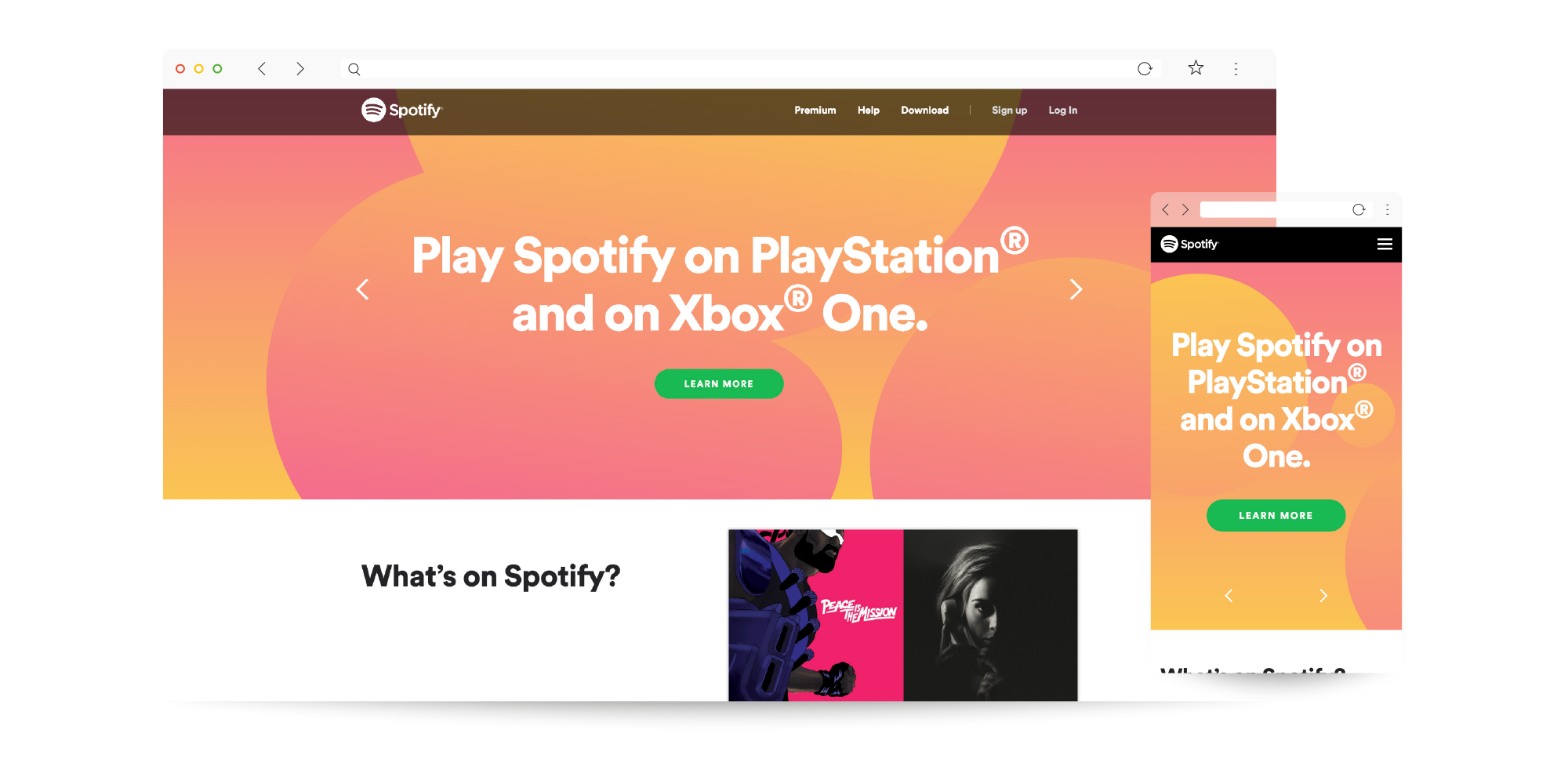
Take a look at Spotify, who are regarded as bringing this colour revolution to the mainstream, and you’ll instantly notice the vibrant pink and yellow background; it’s pretty difficult to miss, really! What’s interesting about this colour scheme is that it clashes ever so slightly with Spotify’s primary brand colour, green. Whilst I’m not suggesting you start using a whole bunch of colours that clash, it is brave to play with colour in this way, sparingly, as it actually helps draw the eye in and makes calls to action really stand out.
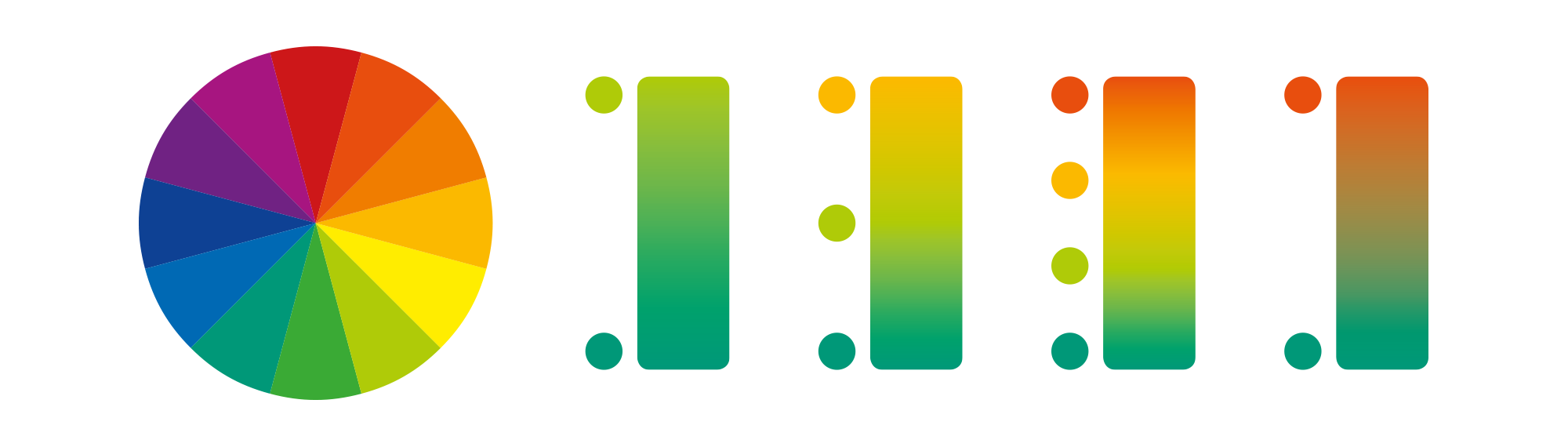
Personally, I prefer smoother gradients between colours that are more closely related or complementary. The easiest way to find out what will work best for gradients is by looking at a colour wheel and choosing colours that are a space or two apart. You can always add more points and more colours to the gradient, but it’s always a good idea to pick related colours to avoid any muddy areas. Take a look at the illustration below to see what I mean, with the first three gradients using colours that are related at each stage, whereas the last gradient uses colours that are from opposite sides of the colour wheel.
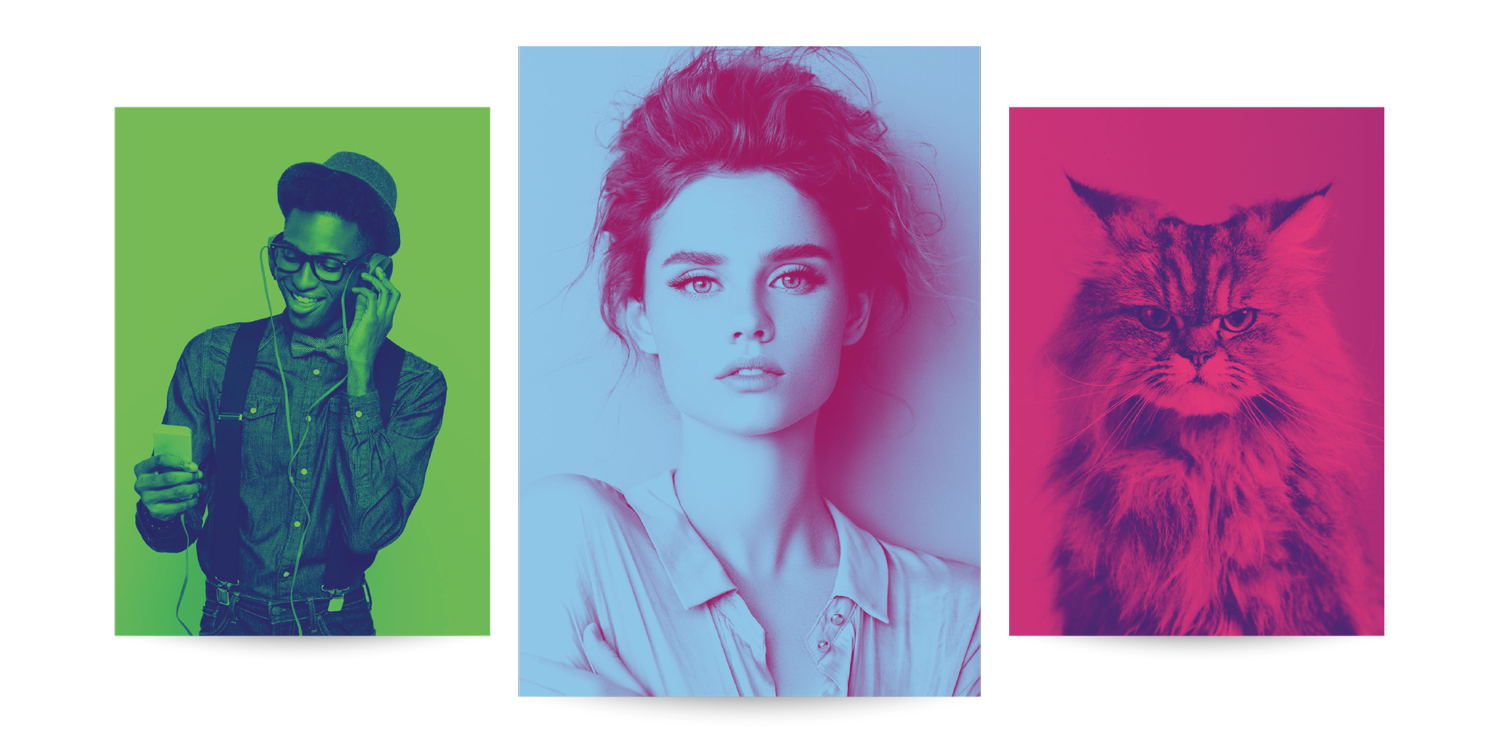
As a side note, this sort of colour explosion isn’t only restricted to the web. Bright colours and bold ‘duotones’ have also made a comeback in printed media and pop culture. The promotional artwork for the recent BladeRunner 2049 film featured a futuristic-feeling neon red and blue duotone theme, the latest album artwork for Love is Dead by Chvrches has a bold, tropical colour palette of hot pink and yellow, even branding design has felt the change, with Instagram revealing their new logo a few years ago.
Below are a couple of examples of duotone photographs that use bold, eye-catching and contrasting colours. These can easily be incorporated into a website scheme but also make great standout images for any image lead brochures or print work.
So colour is pretty big right now, but let's not forget that both black and white can be the boldest and most impactful shades to employ. Look at websites from the likes of Apple, Volvo or Nike and you’ll notice that white, grey and black almost dominate over any other colour. These companies have kept the colour restricted to the imagery on display, which you might argue is the point; draw the eye in to the brighter, more colourful photography. These sites have been almost brutal in their colour avoidance, with Volvo and Apple in particular almost exclusively using black and white for most headings and text with only a few standout colours here and there. This could be more appealing if you’re not a big fan of bold colour, or it simply doesn’t suit your brand identity. It can also look ‘cleaner’ and give the sense of luxury or expense, but I wouldn’t say this is the only way to achieve this.
For the foreseeable future, it looks like bold colour and high contrast is here to stay. In my own opinion, this is a good thing; websites recently went through a transition stage where everything seemed to look alike, especially at a mobile level, so it will be good to inject some individuality, personality and fun back into future designs, be it for websites or brand identities. If you would like to find out how we can help you, get in contact with us; we offer a full range of design services as well as website development and digital marketing.