
Increasing Conversions By Design
Needless to say, we like designing things and, if you’ve been keeping up with our other blogs, you should know that designing isn’t just about making things look inspiring.
Your conversion rate and your website’s design goes hand-in-hand, but as we approach 2019 I’m going to presume that this didn’t come as too much of a surprise.
So it’s crucial to nail those little-touches when your websites in its design stages that can really help boost your conversion rate, but what is there to do? Read on…
Make Your Content Readily Available
It’s widely known nowadays that if your website doesn’t respond well to all screen-sizes, you're going to have a bad time. Not only will users be less inclined to spend time on your site, but Google and other search engines will penalise you for using outdated practices.
Users expect to have the information they’re looking for presented neatly in-front of them, distraction free.
Take for example two of the UX-Greats, Apple and Google - Both of their sites feature distraction free landing pages, allowing their users to browse effortlessly.
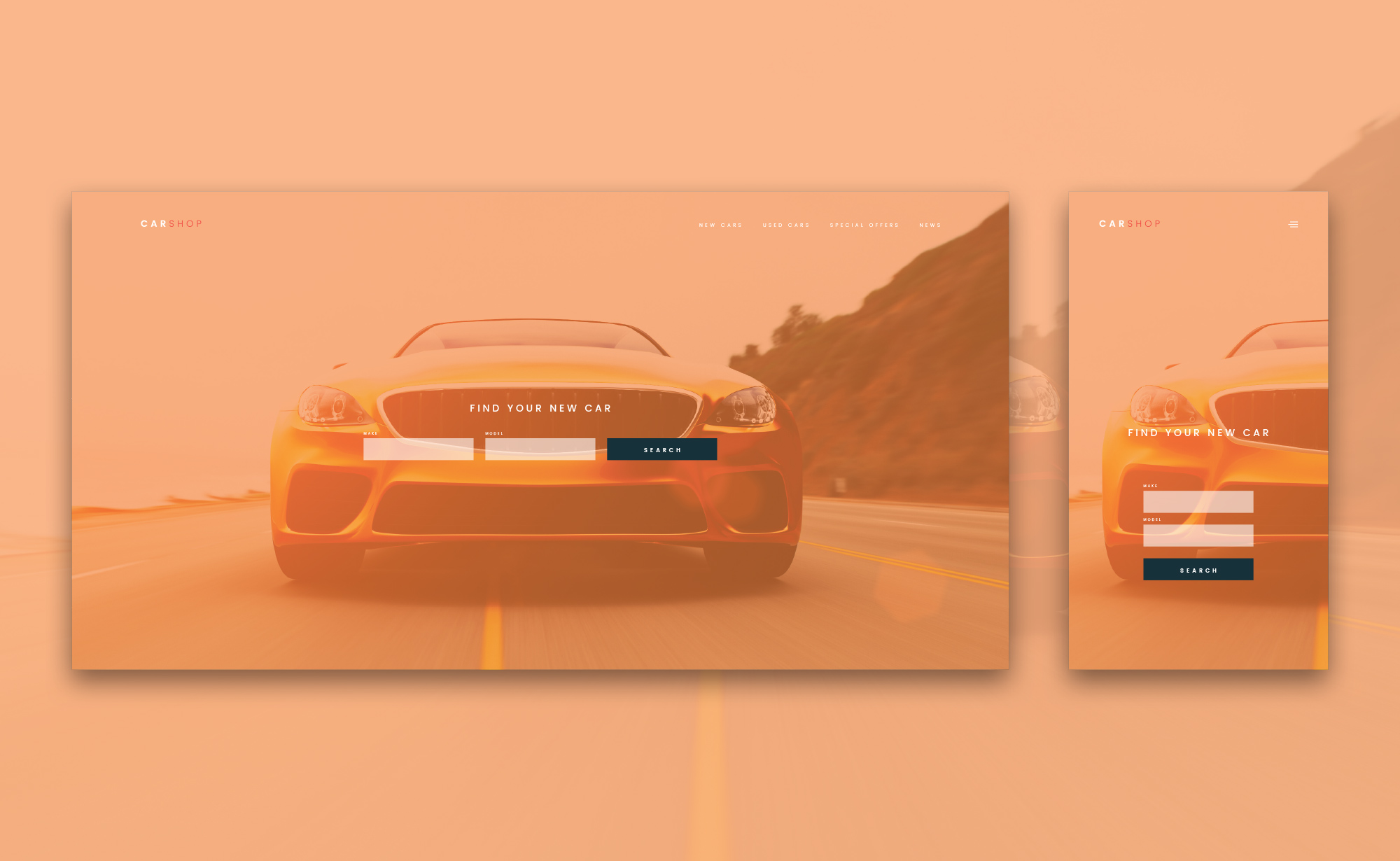
It’s also important that your website designers take note of Hicks Law, which simply states that the more options a user has, the longer that user takes to respond.
HubSpot found that 55% of visitors spent fewer than 15 seconds on your website - What’s even more worrying is that this statistic was discovered around 2014. Studies now suggest that users are spending even less time on websites.
In summary, give your users what they want, when they want it. Don’t confuse a user with a multitude of different journeys throughout your website.
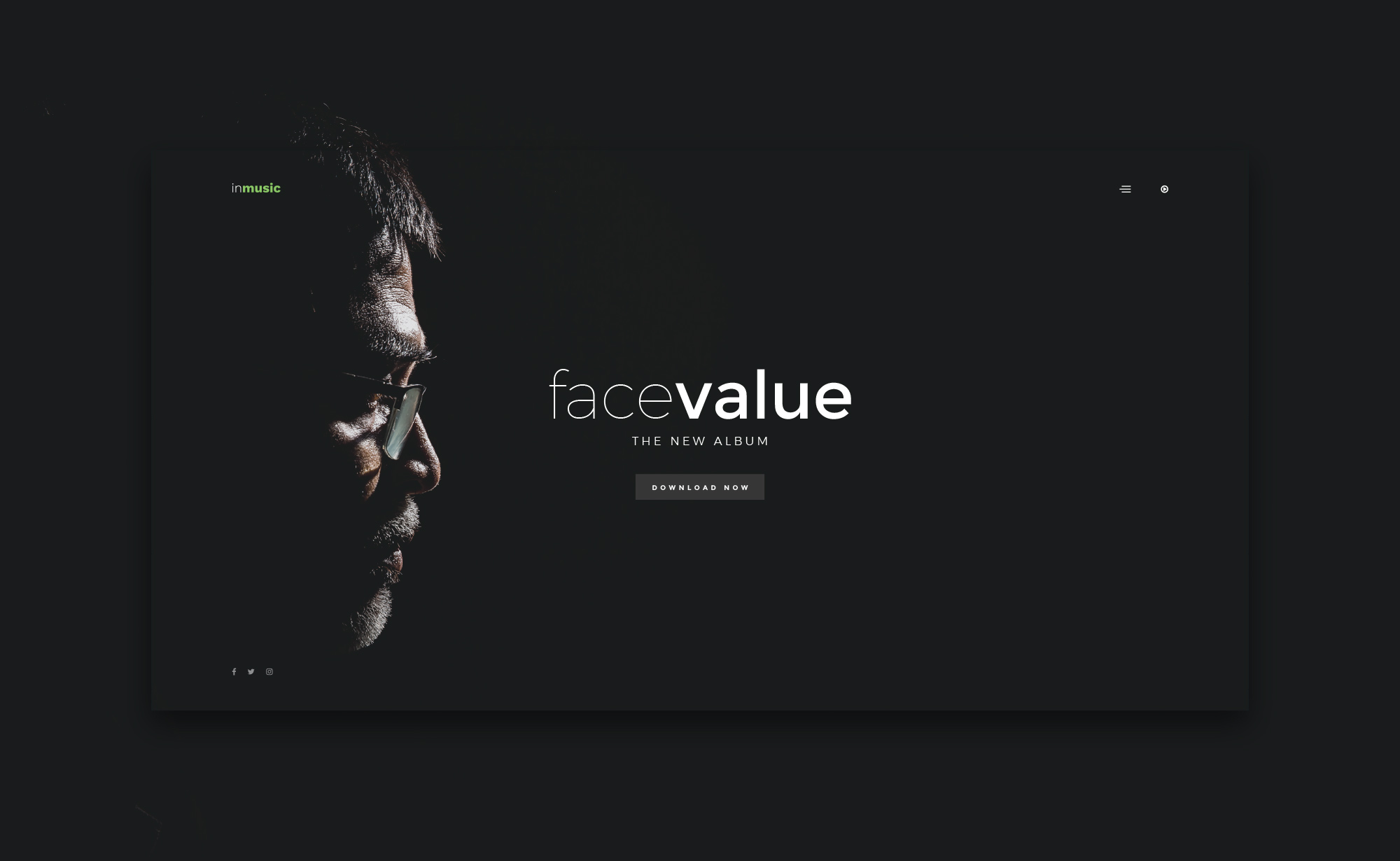
Negative Space - Increase CTA Clicks
White Space, otherwise known as Negative Space in the Graphic Design industry, is most definitely your friend. Negative space are the areas of your site which contain nothing, which may sound boring, but it’s really not. Simplicity is beautiful!
A great example of this is Flat.io's website, which simply features their main call-to-action as the first thing you see upon visiting. Of-course, users can find out more information by scrolling down, but they might not feel they need to due to the strong CTA prompting them to sign up.
Our example uses the negative space in the image to draw the user's eye towards the call to action in the centre of the screen.
Colour and Conversion
As Adobe so elegantly puts it, “Color is one of the most powerful tools in a designer’s toolkit” which is also reflected so brilliantly in HubSpot's infamous split A/B test comparing the primary colours of their CTA buttons in red and green.
The results of HubSpot’s test are astounding with the red button outperforming the green button by 21%, which clearly shows that colour has a major influence on the conversion rate and overall performance of your site.
As our web design team has mentioned in the past, we’re a believer in using colours that reflect a brand, with 2018 being the year of bold colours!
To Summarise…
The design of your website clearly impacts your overall conversion rate and, therefore, it’s important to stay up to date with the latest web design trends to make sure your business is ahead of the curve.